Post-Covid-19 Calcs - Beat The SEIR In Forty Days: Naïvely Modelling Covid-19
Saturday, 11 April 2020By Michael Mainelli & Henry Price
"Since all models are wrong the scientist must be alert to what is importantly wrong. It is inappropriate to be concerned about mice when there are tigers abroad." George Box (1913-2013), British Statistician - often re-expressed as "All models are wrong, but some are useful."
There was once a twisted, three-minute sketch called "Beat The Reaper" (1968) on The Firesign Theatre's comedy album "Waiting for the Electrician or Someone Like Him". A contestant is injected with a disease and must guess what it is in a short period of time in order to win the antidote. In the covid-19 crisis an important method in beating the reaper is guessing how to stay ahead of the game, and that requires epidemiological models. The Institute for Disease Modeling (IDM), which develops disease modelling software, explains the core SEIR model well, likewise The Economist (reproduced below in line with The Economist's commitment to provide important covid-19 news freely). Such models are not new, having been used for many epidemiological studies, including previous corona viruses.
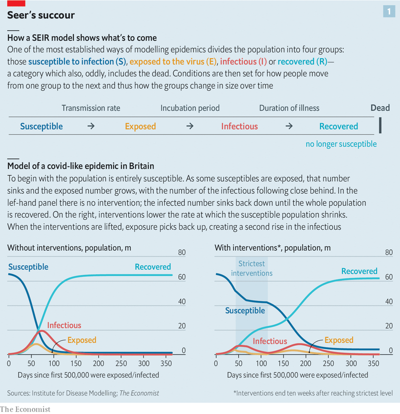
A basic SIR model looks at three factors, those susceptible to infection (S), infectious (I), and recovered (R). Many diseases have a latent phase during which the individual is infected but not yet infectious. Delay between the acquisition of infection and the infectious state can be incorporated within the SIR model by adding an exposed population (E), and letting infected (but not yet infectious) individuals move from S to E and from E to I. As policy-makers depend heavily on epidemiologists, who in turn depend heavily on SEIRs models (seer?, geddit), everyone has an interest in getting this right. Decisions from when to quarantine, isolate, or distance physically will be made, and possibly remade, in virtually total reliance on the models epidemiologists use.
Epidemiology rose to prominence in the UK when the government paid significant attention to a 16 March report from Professor Neil Ferguson and his team at Imperial College, that led to the government closing public places and issuing strict distancing advice on 23 March. This advice has not been without controversy, and some links to browse are contained at the end. Some of the criticism, from places such as Oxford and Stanford, are scathing.
In his hole-poking and excellent book, "The Fortune Sellers: The Big Business of Buying and Selling Predictions" (1999), William A Sherden repeatedly stresses the importance of comparing all predictions with a "naïve forecast", where the last period's actuals are used as this period's forecast, without adjusting them or attempting to establish causal factors. He then uses naïve forecasts to puncture the pomposity of economists, demographers, technology forecasters, weather forecasters, and many other professional members of "the second oldest profession". For example, Sherden developed 'rulercasting' to predict hurricane landfalls. He took a straight line over the locations of a hurricane over the past 24 hours and drew a line to the coast. For 28 hurricanes his forecast error of 121 miles was only 18% higher than the US National Hurricanes Centre's 103 miles. And they had lovely and complex weather forecasting theories and supercomputers. To be fair, this was some time ago, 1979 to 1996 (we are unaware if such simple test comparisons have been repeated). Simple rulercasting provides a good basis from which to evaluate the benefit-cost ratio of more complex, and expensive, methods.
The two authors are not epidemiologists, leaving epidemiology to the experts, pace Michael Gove. However, naïve modelling is a subject on which they are almost experts, with the emphasis perhaps on naïve. This article explores the production and initial results of naïve forecasting as of 11 April 2020.
To restate, the objective is to build a useful comparison model for the SEIRs models that doesn't adjust actuals or try to 'understand' the causal factors. A naïve naïve forecast (sic) might start with a straight line extrapolation from the past few days to the future, as Sherden did with rulercasting. There are two self-evident problems with a linear estimate. First, the rate of increase is itself increasing, thus more akin to compound interest in a bank account. Second, a linear model never turns down. In the worst scenario, there is a fixed total population that means the model is ultimately going to be wrong. The first objection can be addressed by using an exponential forecast, which better fits the historic data. However, an exponential model is clearly unconstrained and equally never turns down. There are many complex curves that can be fitted - think of economists talking about V, W, U, or even L recessions. There are many functions that can produce apparent complexity from simple equations (one of the pillars of Chaos Theory with the poster-child beauty of fractals) and complex equations that can produce either simple or complex outputs. A useful naïve forecast for covid-19 must be able to identify a turning point where the rate of increase turns and slows.
SI Units has built a naïve forecasting dashboard illustrating data from "Coronavirus COVID-19 Global Cases" by the Center for Systems Science and Engineering (CSSE) at Johns Hopkins University (JHU). The dashboard also produces seven to ten day naïve forecasts based on previous case and death reports. The forecast model uses a rudimentary methodology to project future cases if the population behaviour remains unchecked. Forecasts are produced with significant caveats but show the potential crisis facing society if people do not act and take it upon themselves to perform physical distancing. SI Units's most useful naïve forecast is based on a logistic equation. A logistic function creates a common S-shaped curve (sigmoid curve) with an equation based on the natural logarithm (hence the name), the sigmoid's midpoint, the curve's maximum value, logistic growth rate or steepness of the curve. The initial stage of growth is approximately exponential (geometric); then, as saturation begins, the growth slows to linear (arithmetic), and at maturity, growth stops.
All models and forecasts rely on data. There are degrees of uncertainty even about basic facts, e.g. the number of cases and the number of death. There is more uncertainty surrounding primary & secondary causes of death, propensity to test, self-selection in testing, testing methodologies, testing specificity & sensitivity, cultural norms, or household interactions. And that's just a start. The more garbage in, the more garbage out. In an ideal world for the statistician or modeller, there would be regular and rigorous sampling, uniformly and random, with no double-testing. In the real world, with socially and politically driven acts, as well as constrained resources, only sub-optimal data is available.
What sort of things is this model missing that a causal model, such as a SEIR model or intelligent agent model, might contain? Many. For example, connectivity is a large part of what causes spreading, and a model could adjust for the density of populations and agent connectivity. Many secondary and non-linear impacts on the health care system, such as supply chains and population density per facility, need to be considered in forecasting. Perhaps the biggest issue is what Karl Popper called 'reflexivity', circular relationships between cause and effect especially as embedded in human systems such as stock markets. A SEIR model would want to evolve in line with changing human behaviours and culture such as the strength of distancing protocols, wearing of masks, or propensity to follow government advice. Finally, the underlying threat may change if the virus mutates or there is a super-spreading event (fat-tail spreading) such as missing a major vehicle of transmission (pets?) or behaviour (rigid religious event attendance?).
The selected graphs only look at cumulative deaths. Deaths are believed to be more reliably identified and reported than cases. However, the problem with using death data is that it is good for making decisions approximately four weeks back. If the graphs were based on cases they would be good for making policy decisions approximately two weeks ago, but on poorer data. If testing were more rigorous, then cases would be a better indicator for policy, and decisions on policy would move closer to the present (as at 11 April 2020). The graphs start at sixty deaths for each country, allowing countries to be compared easily in terms of their rates of increase and levelling off. What does the dashboard show?
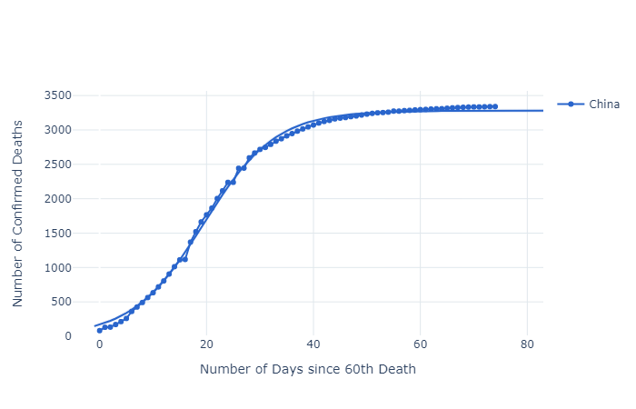
China, as the first country exposed, has many lessons to teach, not least that 'lockdowns' appear to work in slowing the spread of covid-19, perhaps even in its tracks. Note too that the levelling off period appears to be approximately forty days after the first sixty deaths. Also note that two significant 'kinks' in the actual numbers at days 16 and 26 don't disturb the accuracy of the logistic function.
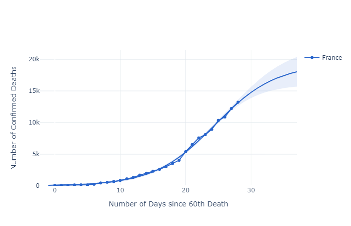
France has two interesting kinks as well at days 19 and 22, but the logistic function still fits well. These, and the Chinese anomalies, may be due to data reporting time lags, changing data definitions, data supression, or just normal volatility.
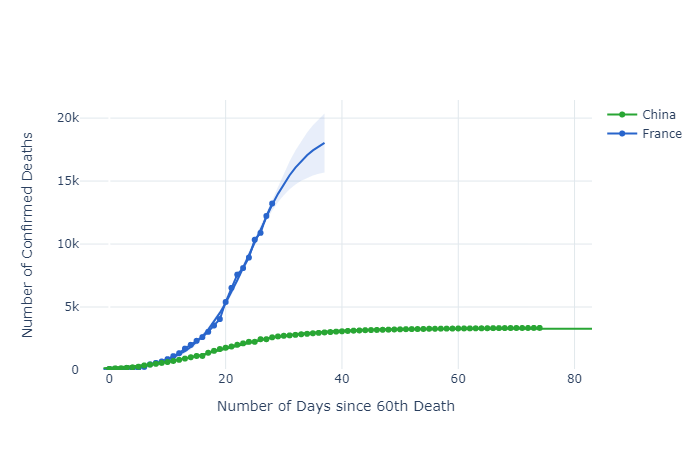
Comparing China and France is disturbing. First, these graphs are not normalised for population size, e.g. deaths/day/capita. This means that the French figures for a population of 67 million on day 28 (13,215 deaths) are already five times as high as those for China with a population of 1,386,000,000 on day 28 (2,595 deaths). All other things being equal, and they're not (population age, general health, lifestyles, social contact norms), the French figures would be closer to 125. Further, the French had more warning of the impending covid-19. To add to the unease, total Chinese deaths at day 74 are only 3,340.
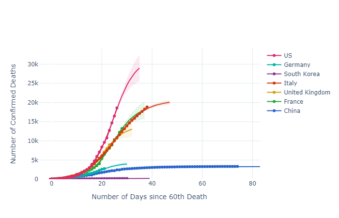
Thus, looking at seven selected countries, it is highly likely that the wildly differing death rates will lead to much discussion about what governments do and don't do, as well as what they should and shouldn't do, during pandemics. Without clear data on demographics and susceptibility as yet, let alone the inability to compare 'cases' internationally, nevertheless it seems clear that testing, tracing, and physical distancing can make an enormous difference to death rates. Earlier detection enables better treatment and avoids triage, and it helps to contain random spread from hotspots.
The stark contrast of South Korea and Germany with the USA, UK, France, and Italy is disheartening indeed, if this is truly 'excess mortality'. There will be much post-analysis, accompanied by much mud-slinging, but there appears to be much we need to learn. Models that explore what-might-have-been will help inform future policies. At the very least, the analysis above underscores the potential value of regular and rigorous sampling, uniformly and random, with no double-testing,
Thoughts
So far, and this is a limited period of time, naïve UK forecasts provided by a logistic function are, not surprisingly, close to Imperial College's forecasts. The aggregate national numbers hide many smaller clusters, demonstrating the central limit theorem - when independent random variables are added together their properly normalised sum tends toward a normal distribution (informally a bell curve) even if the original variables themselves are not normally distributed. The case numbers bounce around a mean, 'noise' around a solid trend. Changes in behaviour will lead to modifications of the parameters, i.e. things rare not stationary. Of course, this presupposes that for a reasonable time frame those recovered remain immune and uninfectious. This might not be the case if the virus mutates. A case of SEIR - then back to S. That said, in perspective, viruses mutate all the time, most of those mutations are detrimental to the virus. The question for all modellers is how much better are they than a simple rulecasting or naïve forecast. We will see.
Moreover, economic modelling has only just begun. The scale of government policy responses to covid-19 is breathtaking, and has serious implications for political, economic, and social transformations over the coming years, as well as financial services. Economists are already on a bout of modelling that is comparably breathtaking.
In 1353 Giovanni Boccaccio shared one hundred tales told over a fortnight by ten Florentines isolating themselves from the plague of 1348 in "The Decameron". As for 'beating the reaper' today, one of the more unusual points here is that where the logistic curves appear to 'flatten' is close to forty days. From Fuxian to Felixstowe to Florence, forty days flows from simple logistic functions and fits the data. There are fundamental insights from naïve models. The word quarantine enters the English language in the early 1600's, from the Venetian Italian quarantena, a period of forty days, in turn from the Latin quadrāgintā. Medieval Italians may have guessed correctly by picking forty days as the appropriate time for quarantine over 500 years ago. For you conspiracy theorists, is covid-19 some kind of Medici plot?
"The purpose of models is not to fit the data but to sharpen the questions." Samuel Karlin (1924-2007), US mathematician.
References
- SI Units's data analysis, exponential and logistic dashboard is interactive and you can make your own charts in seconds.
- Cases and maps globally from Center for Systems Science and Engineering (CSSE) at Johns Hopkins University (JHU) - Coronavirus COVID-19 Global Cases.
- Another useful, and fun, site, worldometers for comparative browsing on coronavirus https://www.worldometers.info/coronavirus/#countries
- Z/Yen's corona virus bulletin focused on 'deep news' - if you wish to receive this weekly, sign up here.
- UK data analysis - https://covidlive.co.uk/.
- TS Lombard's compilation of government policy responses to covid-19 - https://blogs.tslombard.com/government-policy-responses-to-covid-19.
- For an unusual conceptual exploration of chaos theory, fractals, and the planet - "Metamorphoses – The Terrible Beauty of Change".
- For articles illustrating some of the concerns, controversies, and characters in epidemiological modelling, the following are worth browsing:
- medRxiv - The Preprint Server For Health Services - leading edge of research
- "Fundamental principles of epidemic spread highlight the immediate need for large-scale serological surveys to assess the stage of the SARS-CoV-2 epidemic" (26 March 2020) - Oxford team's thinking on importance of large-scale serological studies - as well as preprint discussion
- "The simulations driving the world’s response to COVID-19", Nature (2 April 2020)
- "Soap Opera Science", Hector Drummond blog (30 March 2020) - background to a controversy
- "The Londoner: History behind Imperial and Oxford scientists rivalry", Evening Standard (1 April 2020) - media take on controversy
- "Mathematics of life and death: How disease models shape national shutdowns and other pandemic policies", Science Magazine (25 March 2020) - good think
- "Why a study showing that covid-19 is everywhere is good news", The Economist (11 April 2020) - reporting on exposure
- "A fiasco in the making? As the coronavirus pandemic takes hold, we are making decisions without reliable data", Stat (17 March 2020) - Stanford views from Professor John P A Ioannidis"
- The Mathematics of Predicting the Course of the Coronavirus", Wired (30 March 2020)
- "Don't Be Fooled by Covid-19 Carpetbaggers", Wired (5 April 2020) - ending on a salutory note
Z/Yen & Covid-19
As people concerned about the health of our colleagues, friends, families, and selves, Z/Yen is applying its simulation modelling and skills in new ways.
About The Authors
Professor Michael Mainelli is Executive Chairman of Z/Yen Group. Henry Price is CEO of SI Units and a doctoral candidate at Imperial College.